Tuesday, November 18, 2008

Central Park happening


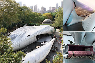
Currently in Central Park there is a unique museum design. To honor bag designer Coco Chanel. Whats inside of the museum isn't the largest attraction though. The unique design of the museum itself is what makes this exhibit unique. The museum is transferable and can be packed up and moved from city to city very easily! I just thought it was a fun little story! 
The following link is a short little article about it!

http://nymag.com/arts/art/features/51351/


Monday, November 10, 2008

Anabliss Design

We recently visited local design studio Anabliss Design and Hadley Hooper's exhibition and workspace at Irontron Studios. It was definitely very interesting to see two completely different types of work spaces. Anabliss was very modern, low key and simple. There was about 4 designers working in the studio. I think this was a more likely studio for me. I loved everything about Anabliss from the type of work they did, to the people and the studio they worked at.
Hadley Hooper's studio was the complete opposite from Anabliss. She works with several different types of artists. This was interesting because they can all pull inspiration from each other. She does more illustration work which I am not as interested in, but her work is still beautiful. It was very interesting to see local designers at work and give us a sense of where we might be!

www.anabliss.com
www.hadleyhooper.com

Friday, September 12, 2008

John Pirman

The guy that I tried to get in touch with for a while finally got back to me with his answers about the Urban Forest Project...
1.) How and why did you get involved with the project?
My Best friend Mark Randall, of WorldStudios Foundation, invited me to contribue an illustration
2.) Would you consider yourself and environmentalist?
No I am not an activist or environmentalist, though I am very "green" conscious
3.) I understand your concept for the project came from a childhood project.  What was the project and how did it influence your idea for this particular project?
This was a "how to" project for "Highlights" magazine that I remember doing as a young boy. When the banner project came around, this leaf idea immediately came to mind.
4.) How did you incorporate your style to spread the meaning of Urban Forest?
I use simple refined shapes, and bold color to get the visual meaning across fast.
5.)I learned that you do a lot of work based on geometry. Can you tell me about how you were able to incorporate that into this piece?
By placing symmetrically drawn overlapping leaf elements in rectangular shapes, a very controlled visual rhythm takes place that creates a motif.
6.) Do you do a lot of pro-bono work?
No
7.)I read a comment you made stating "simplicity is harder than it looks." Can you explain what you believe is the "less is more" theory and why you believe it is relevant to your work?
I consider myself a "modernist" and "minimalist" in the way I live my life, and in the way I do my illustrations. To refine, subtract from, and create harmony in my life and art takes a lot of energy and time. Once that is accomplished, I am satisfied.
8.) Do you draw from real life or out of your head?
I usually do not draw from life only because the things I draw are not physically possible to draw from. The leaves were drawn from photos.
9.)How do you come up with your geometric designs? Do you use the Golden Mean theory or something else?
Intuition is key. I go with a gut feeling. There is no explanation for this. I guess it is something I am born with.
10.) Why are you interested in geometric designs?
Because it speaks an abstract visual language. Modern 20th century artists such as Sonia Delaunay, Stuart Davis, the paper cut-outs of Henri Matisse, Mondrian, have heavily influenced me. Also, the simplicity of WPA posters have made a big impression on me.
Tuesday, September 9, 2008

Denver's Own Urban Forest


Last year during October 7th-20th, the streets of Denver were filled with 48 banners portraying the same idea as those in Time Square. 24 professional designers were paired up with 24 students and each team created two banners to be displayed side by side. The banners hung on California between 14th and 16th.
The banners were donated by Banner Collections and were constructed from a unique fabric called Ecophab, which is made from 100% recycled plastic bottles. Just like the New York project, the banners were then recycled into tote bags and auctioned off. The tote bags raised $2,500 and was donated to education initiatives.
I don't remember seeing these around, although, now that I am involved with design, I wish we could do this project again and get involved!

Beauty in Time Square


Project Goal:To start with the simple concept  of a tree and see where it took the designers artistically. The idea of the 185 banners was to provide passers-bys with a beautiful aesthetically pleasing break from the bright lights and signs that make up New York's Time Square as well as spread the awareness of the depleting tree problem. The idea was that not everyone who saw the posters would get the idea of sustainability instantly, but more just to get them to think about nature within the city.

Initial Concept and Approach:
One of the talented young designers involved in the Urban Forest Project was student Wednesday Trotto. She began this project having no knowledge in gra
phic design. Until she met Emma Presler, a professional designer and board member of the AIGA for the New York chapter. The saying, "If a tree falls in the woods, will someone hear it," was the basis for their inspiration. The birds on their banner symbolically "carry the sound of a lonely tree, falling on nonexistent ears." I thought it was very cool that not just professional designers were involved in this project. There were a total of 22 mentor and student pairs who participated in this project! I wish that I could have been a part of it.

Client/Designers:
The idea for this project was started by Mark Randall, prinicpal of WorldStudios. Mark stated that the idea for the Urban Forest Project was started because WorldStudios is always looking for a creative way to spread environmental and social issues. When giving the assignment to designers, Randall told them that they could explore trees in a "variety of different ways, with messages of politics and the envrionment." Sustainability was not their ultimate message as he just wanted the designers to have fun and make an entertaining statement. The only requirement that was given was to make the posters out of some  form of plastic.


Solution:
After the posters hung throughout the streets of New York for several months, they were send to travel bag designer Jack Spade. From there, he turned the banners into tote bags, which were eventually auctioned off. This way, the idea of sustainability can be spread by sustaining the life of not only the banners, but the designers as well.

Friday, September 5, 2008

Urban Forest Project

The Urban Forest Project took place last fall on the streets of New York. 85 designers and artists got together to employ the idea or form of the tree to make a powerful visual statement on the banners. The idea was that the tree is a metaphor for sustainability and in that spirit the banners from the exhibition were recycled into totebags after the project was concluded. I found several design firms and artists that were very interesting looking through the banners. I am currently in the process of talking to John Perlman. His banner is shown along with a few others I found interesting!